Content
Brand Identity Design for Kofounder
Kofounder is a platform designed to empowering individuals to collaborate, build and grow products that they wish existed. Its core values are collaboration, growth, and simplicity—reflecting a vision of enabling innovation through teamwork.
To align with these principles, Kofounder needed a brand identity that was simple, modern, and approachable. The goal was to create a visual language that inspires trust while emphasizing partnership ad growth .
Concept
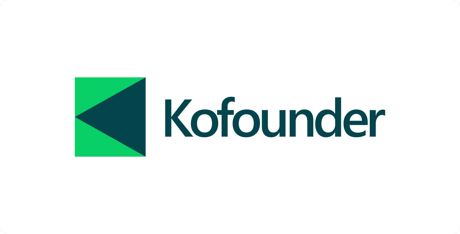
The Kofounder logo combines simplicity with symbolism. It features a forward-pointing arrow, representing progress and momentum, while also forming the letter K, the first letter of "Kofounder."
The design consists of three geometric shapes:
A triangle, representing direction and focus.
A square, symbolising stability and structure.
An invisible circle that encompasses the square, triangle and letter K, highlighting collaboration of different entities and innovation.
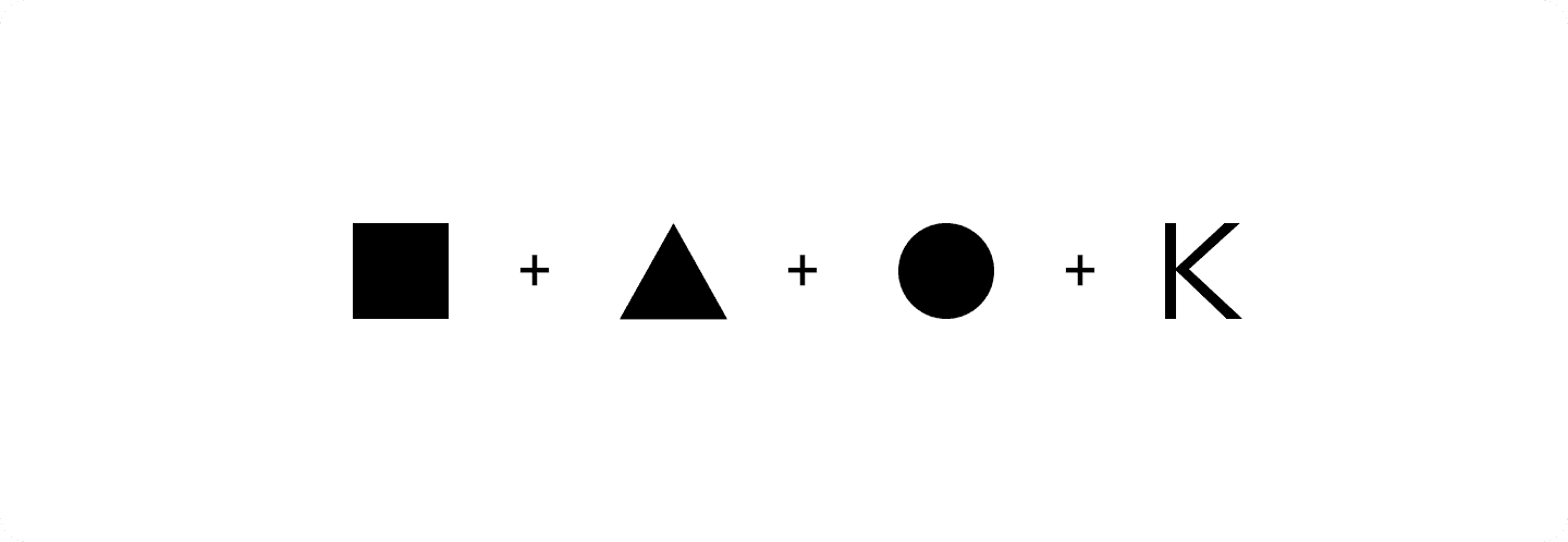
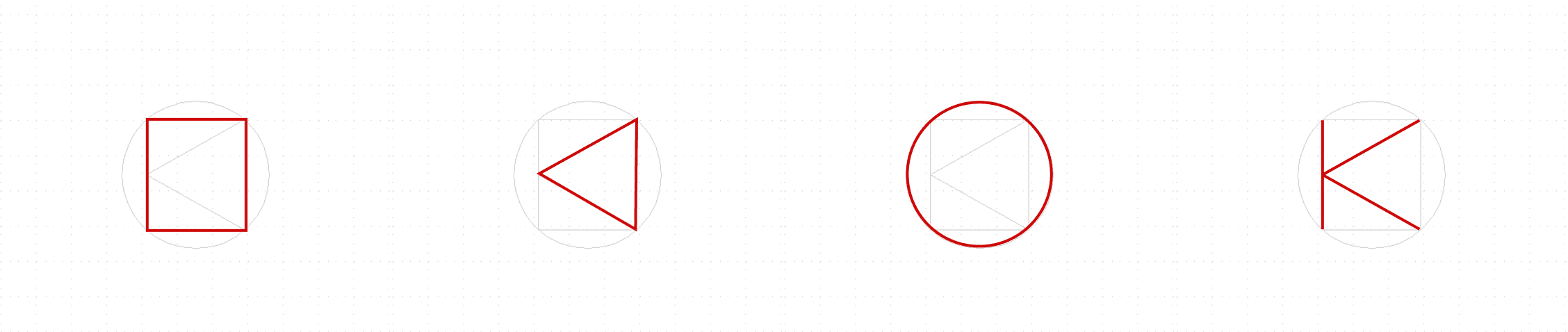
This thoughtful composition ensures the logo is both meaningful and visually striking, perfectly embodying the platform’s mission of collaboration, growth, simplicity & Innovation.
Logo


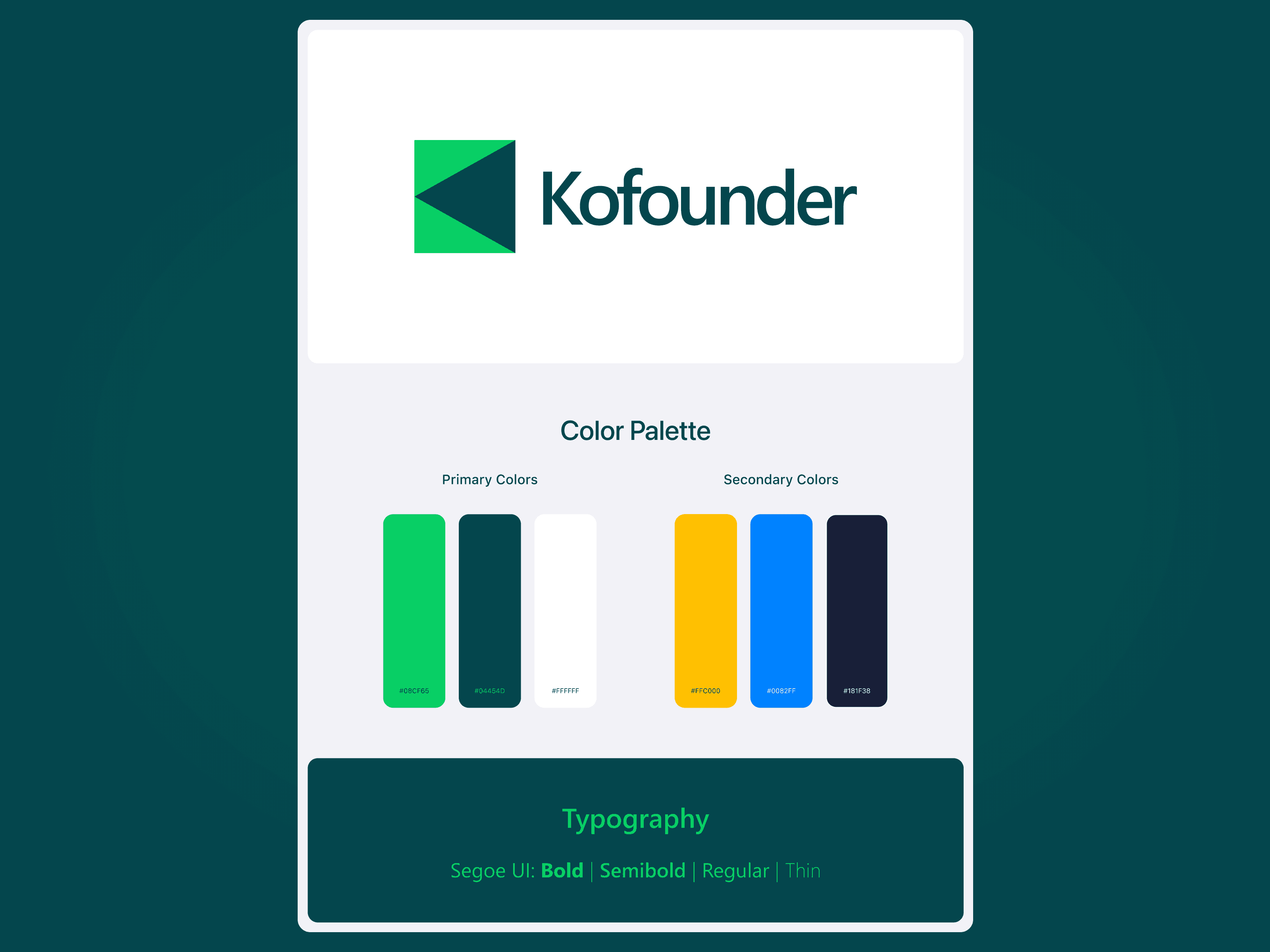
Color Palette
Color influences a persons physical and emotional state. Green, White and Blue are our primary colors. Cooler colors spark feelings of energy, trust, security and confidence. Secondary colors extend and complement the primary palette. These color combination adds, dept, versatility and an amiability to the brand.
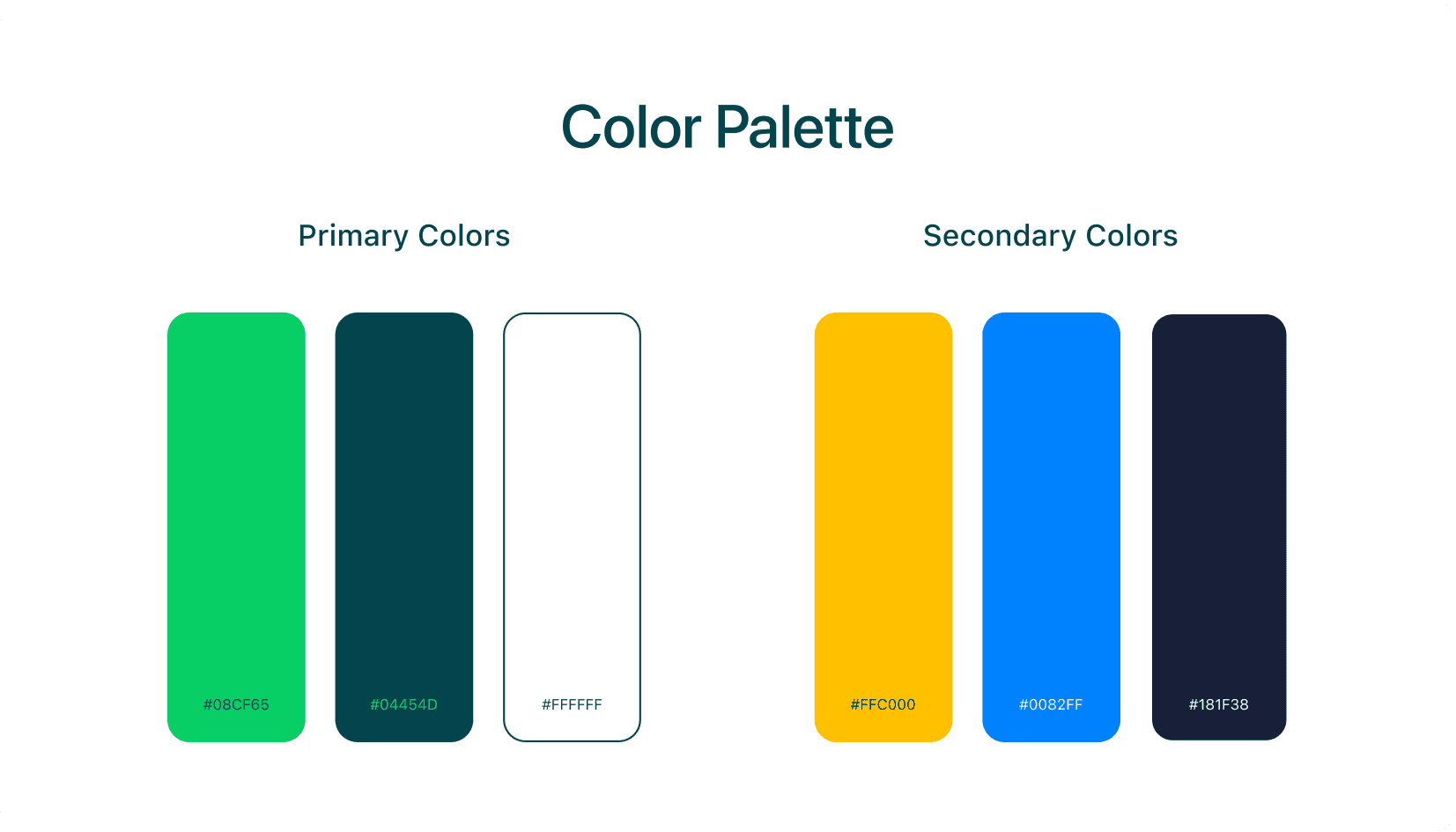
Primary Colors:
#08CF65 (Green): Represents growth, collaboration, and innovation.
#04454D (Teal): Signifies stability and trust, ensuring a professional tone.
#FFFFFF (White): Reflects clarity, openness, and simplicity.
Secondary Colors:
#FFC000 (Yellow): Adds a touch of optimism and energy, symbolizing creativity.
#0082FF (Blue): Highlights ambition and forward-thinking.
#181F38 (Dark Navy): Grounds the brand with a sense of sophistication and authority.
Together, these colors create a dynamic and approachable visual language, setting the tone for an exciting and reliable collaborative platform.


Typography

Typography plays a crucial role in Kofounder’s branding. I chose Segoe UI, a clean and modern sans-serif typeface, for its clarity and versatility.
Font Weights Used
Bold & Semibold: For headers and key messages to grab attention.
Regular & Thin: For body text and supporting content to maintain readability.
This typeface reinforces the platform's professional yet approachable identity, ensuring all text feels intuitive and accessible.
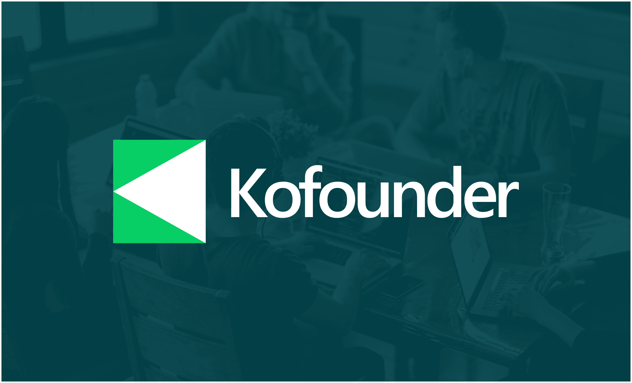
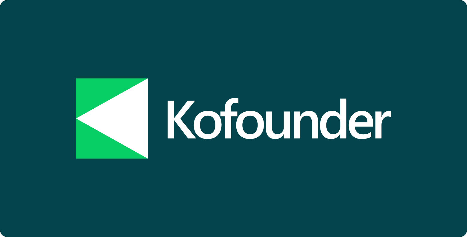
Logo in Action
Whether it’s displayed on a light or dark background, the Kofounder logo adapts beautifully. Its bold and minimalistic form ensures it remains recognizable in all contexts, from app icons to business cards.

Conclusion
Designing the Kofounder brand identity was a rewarding experience that combined creativity, strategy, and a deep understanding of the platform’s mission. This identity represents what Kofounder stands for today and positions it for growth as a pioneering platform for collaborative ventures.